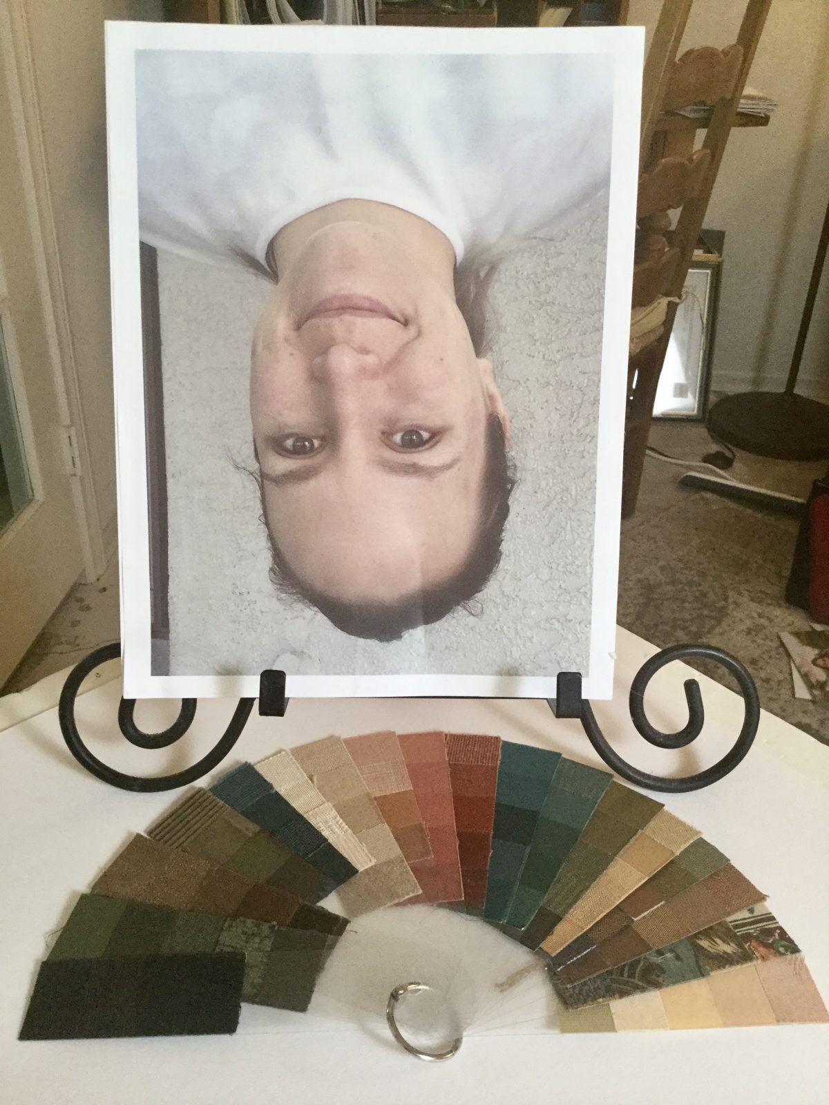
A simple but effective trick I learned in atelier training for classical painting and drawing, is to view the subject upside down. This confuses the brain’s tendency to label things. I would hold a small hand held mirror up to the bridge of my nose, and view the subject (then model, now client) upside down. I still do this occasionally and recommend this technique to my color analysis colleagues so they will see color more objectively, free from symbolism. Right away, you will see shapes and even color more accurately.
Because a routine part of my process is to work from color corrected photographs of my clients (which I take) I’ve developed a simpler way to work from this technique: I simply turn the photograph upside down when working on the color palette. Much easier than turning the client physically upside down! The upside down image helps to see the client more objectively and to render accurate color palettes whether I’m painting the palette or using color swatches from my Caygill system. Sometimes the visual truth is more evident when we can’t attach our habitual labels to what we are seeing.
To my color analyst colleagues, I invite you to try it and let me know what you think.
In the next post I will be exploring the intersection between Enneagram and Style Analysis.
In the meantime…
May the colors be with you,
Pati
Master Color Designer
Seasonal Color Studio


