Personal Color Analysis (PCA) was birthed around middle part of the last century, when skill based art training and the visual language we know as fine art was decimated by the modern art movement. PCA came into being and was largely thought of as a magical process by which it’s pioneer, Susanne Caygill, made pronouncements about her impressions of people who came before her.

She was trying to always understand how the laws of color were meaningful to the visual impression of a person. I remember the beautiful and luxurious surrounds of her well attended sessions. It WAS magical. She was really a remarkable person. But at the time she started teaching her theory there were only 5 people in the U.S teaching the time honored traditions of rigorous atelier skill based exercises necessary to learn the visual language of picture making. Because of her personality and also the wide spread cultural bias to un skilled picture making, there was little information about how to pass along the bank of thought she evolved through her years of practice in the field. Consequently there has been scant educational models for all of the visual arts, including PCA. I’m sure this has much to do with the widespread inconsistencies across all the various color analysis systems that have evolved since then.
In spite of that, the collection of ideas called PCA grew into a living language through the dedication and passion of a few notable individuals. This system, the Caygill Color And Appearance Design System which I am trained in, is the fountainhead for all color analysis systems that have evolved throughout the world. As it stands today, I consider PCA more of an art form than a housewives hobby which is how it has mainly been treated. As a practitioner, I treat it with the same respect and reverence as fine art. Luckily, the atelier training which gave me the skills to understand the language of visual art serves me well in my quest to understand color analysis and the effects of light on human skin.
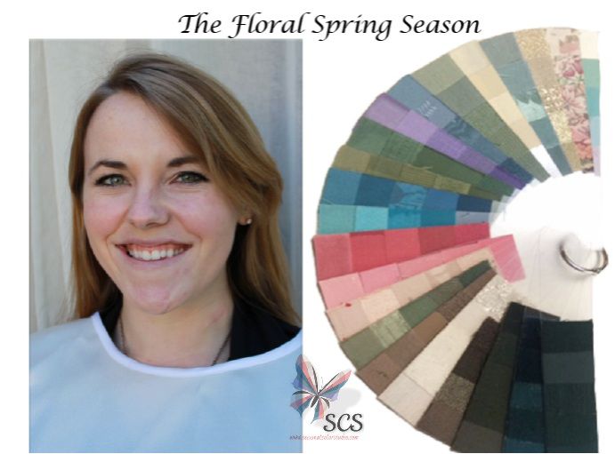
In the case here I had to do many “statements” of Kianna’s coloring before I began to understand it. I was lucky to receive good technical feedback from a mentor, and after painting her skin tones could see that there were two different color “events” happening on her skin.
Floral Springs are commonly confused with Rose Tone Summers. The Floral Spring is brighter although they have some of the characteristics found in the appearance of the Rose Tone Summer type. My model, Kianna, has facial characteristics that remind me of the spring type: short distances between her horizontals and upward movement in her features. But, she has pronounced pinkness in her otherwise peach skin tones. Once I understood this, and practiced building color around the newly painted sticks, I was able to see just how bright and fresh her palette had to be in order to accurately describe her through color.
In fine art, which started as a visual means of communication, an artist communicates using visual things and objects to communicate thoughts and emotions to the viewer. When the communication has been successful it can be considered fine art. And, for it to be considered a language it must be a successful communication.
I think of Personal Color Analysis as a visual means of communication. And as any good language it is comprised of a common vocabulary, grammar and rules. Which require skill based training in order to learn what those are. This has certainly been a big stumbling block for PCA becoming a commonly understood language. Just as in fine art, I believe there is no better way to convey the skills, which are like the “grammar” or “vocabulary” of PCA than through mentorship. For this is how all “language” whether it’s fine art, literature, music or PCA is passed along and it’s legacy preserved and evolved.
This Floral Spring palette is a successful visually communicated abstraction of this beautiful young women’s appearance design. And so here it is…the visual language of the Floral Spring archetype.

