Hi everyone! I realize it has been a remarkably long time since I’ve written a blog post. I’ve decided to use my natural long form style to make my blog posts meatier. I am writing TLDR for some of you. If not you though, grab a cup of coffee or glass of wine and settle in.
First, here’s news on the color consulting side of life: If you’ve had deep dive color analysis (as opposed to the formulaic, online variety), you’ve been exposed to the idea you look like what you’re built for. For example, one of my teachers, Dwyn Larsen ( 27 Types of Beauty) used the analogy of the Thoroughbred Horse: lean, sleek and built for speed.

Thoroughbreds look sleek and are built for speed.
Compared to the draft horse which is big, broad, and muscular; built for strength and endurance.

Draft horses are built for pulling heavy carts and machinery long distances.
This profound but simple observation is foundational to color/style analysis in general: we gravitate toward that which is harmonious and native to us. What we look like has a lot to do with what we are drawn to and by logical extension, what we find most interesting is also usually most useful.
Seasonal Theory, the keystone for orthodox color analysis is based on the idea that a person’s outward appearance, specifically skin tones and body signature say a lot about a person’s personality – the interior aspects of a person. For example, a common example in the color world would be that warm toned people tend to be more extraverted, assertive and louder. Cool tone people are quieter, held back and introverted. People with intense coloring tend to be bolder, while those with blended, soft impressionistic coloring are gentler types with a tendency to be indecisive – their strength being more on the inside. These are just a few of the signifiers we use in color analysis and, an oversimplification of what my color practice has shown me to be true. Moving beyond Seasonal Theory and into the surgical precision of orthodox Enneagram personality typing has been helpful in my practice. There have been times when designing color palettes for clients that the intensity called for in their natural coloration did not render enough intensity to match their match their personality.
Here’s what I mean:
Client “S” is an Iridescent Summer in Seasonal Theory and in Enneagram, she is the Self Preservation/ Social 269 Tritype®. Just knowing her dominant Enneagram type after finalizing her palette 5 years ago, inspired my decisions to revisit about her palette. Because of her Enneagram type, she needs a palette extension that more accurately reflects her as a heart type and a 2 as well as a Summer. The personality type 2, and especially with this 269 Tritype® loves brighter color. Coming from the heart center of intelligence, they want to be appealing to others. Her palette already reflects the amount of intensity you can see on her, but what you can’t “see” is how she wants to appear to others. This is why Enneagram is so helpful when fine tuning a palette. Summers tend toward blendedness, so I will have to add “brightness” to this palette to fully honor Client S as a 2 and a Summer.

Now, look at the intensity of color she prefers to wear most of the time:
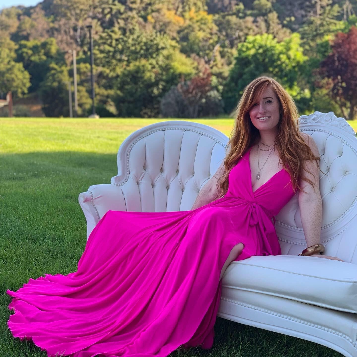
“Fashion Brights” are what we call color that is found in sportier styles, and adding some of these almost electric pinks will tweak her color palette to the brighter side. But, it is important to note, that there is a little less visual harmony both in the palette as an abstraction of her as well as when she wears these colors. But…sometimes value, intensity and color harmony take a back seat to the emotional need for being noticed. The 2 loves people, has an uncanny sense about what people need, and are happiest when they feel appreciated. Typically, the 269 is not the flamboyant 2, however, Enneagram Wing Theory does help explain her love of flamboyant color: she has a 7 wing on her 6. This person wants to look appealing to others and as is true for many of the 2’s she naturally has a receptive pout to her lip, bright eyes, or energy coming through the eyes, and uses bodily gestures that encourage human connection. She is also quite assertive – a quality characteristic of the type and quite often missing in many Enneagram books’ description of the 2.
ON THE FINE ART SIDE OF THINGS…. I finished several paintings during lockdown (a circumstance I found very life giving). The creativity of this last year was downright exhilarating and I can’t wait to share more about it. For now, here is a painting from my Faerie series:
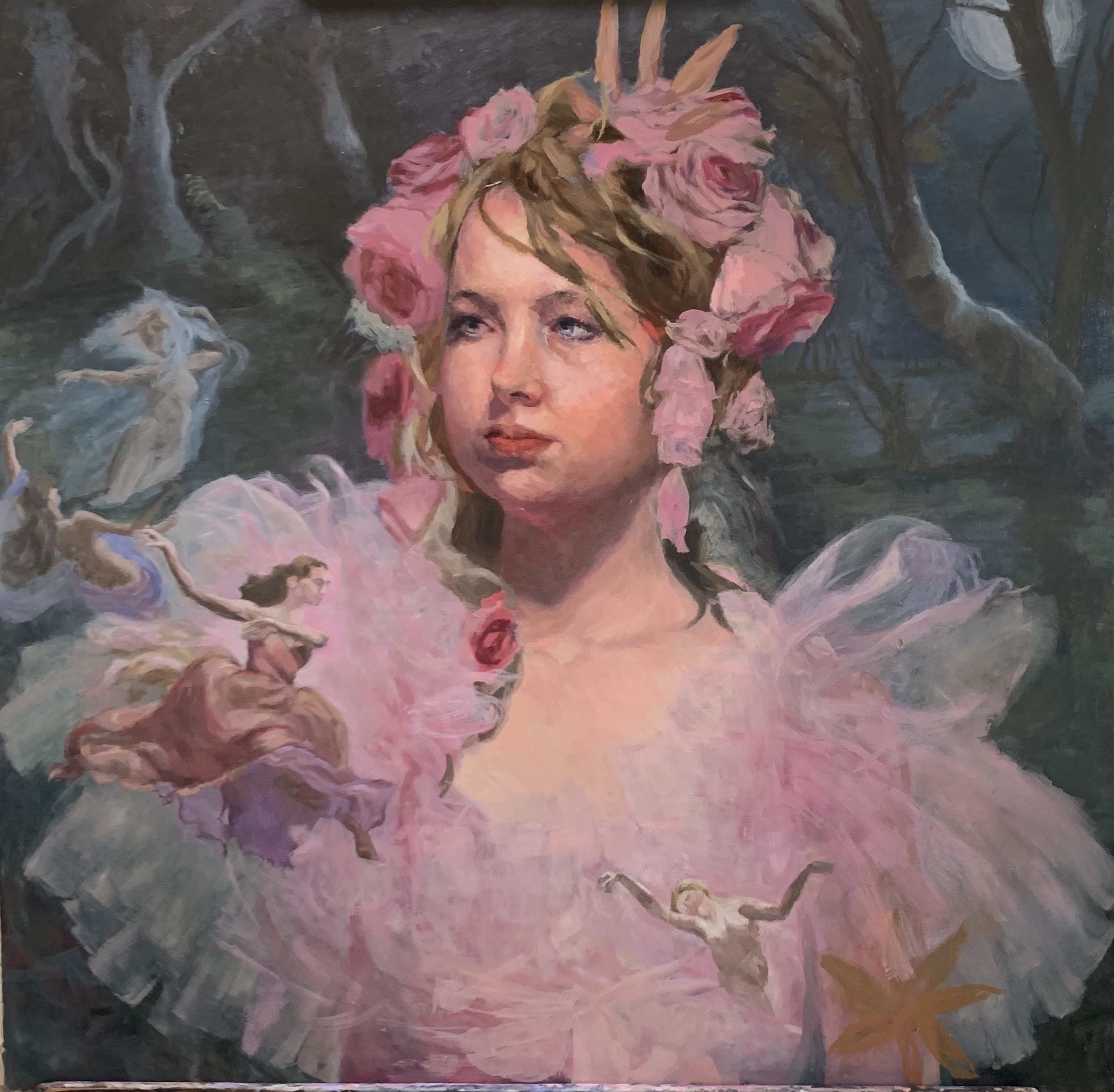
Oil on board, 28″x 28″, in progress
One last piece of news is if you are ready for the next step in stream lining your wardrobe and improving the way you look, I am continuing to conduct color analysis sessions online rather than in person. Although the mask mandates have been lifted, the accuracy (it does take practice!) of online analysis combined with worldwide outreach just can’t be beat in my opinion. I’ve really enjoyed getting to know clients from all over the world these last two years during Covid lockdown. So don’t let distance deter you from booking an online session.
And as always…
May the colors be with you,
Pati